How to make a bar chart
to do
- update links
- complete narrative
Bar chart, also called a bar graph, or column chart in many spreadsheet apps (e.g., Google Sheets, Microsoft Excel, LibreOffice Calc — “bar charts” is reserved for horizontal bar plots), are used to compare counts among two or more categories, i.e., an alternative to pie charts (Mike’s Biostatistics Book). Histograms are a type of bar chart — see Histogram from a spreadsheet pivot table.
To create a bar chart in Google Sheets, select your data, go to “Insert” > “Chart” in the toolbar, then choose “Bar chart” from the Chart Editor panel.
See Google Sheets help page at https://support.google.com/docs/answer/9142829?hl=en
Example
From the exercise Find all SNP for your GOI, we asked to summarize SNP counts for a gene by DNA element, where DNA elements of a gene include 3-prime UTR, 5-prime UTR, exons, and introns. Data collected Spring 2025 for human HIF1A (gene id: 3091) shown in Fig 1.
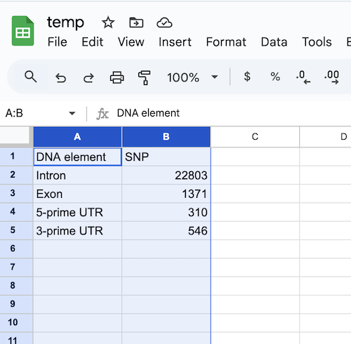
Figure 1. Screenshot of spreadsheet with data.
A crucial part of successful data visualization is the story — what message should the viewer draw from your graphic? In this case, the emphasis is on “how many” of each kind — if we leave it to Google Sheets, then by default, the data are sorted alphabetically by the first column. In our example, ascending, this would be: 3-prime UTR, 5-prime UTR, Exon, and Intron. Nothing horrible about this choice, but sorting alphabetically is arbitrary and doesn’t further our story-telling about “how much.”
Instead, sort descending order by SNP counts (Fig 2 and Fig 3). From the menu select Data > Sort range (not Sort sheet), then select Advanced range sorting options (Fig 2).
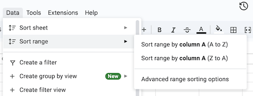
Figure 2. Screenshot Sheets sort menu.
The popup menu from Advanced range sorting options is shown in Fig 3.
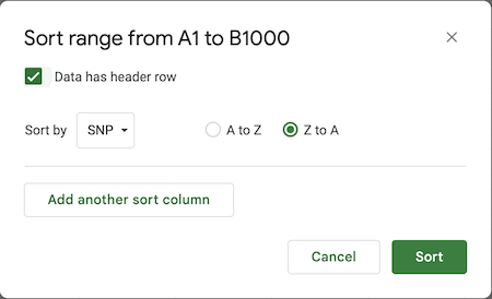
Figure 3. Screenshot Sheets sort menu options.
We inform Sheets that our data contains header rows — otherwise, Sheets will include that row in the sort — and select the column (SNP) and descending sort (Z to A).
Once the sort is completed, we’re ready to make the chart. A quick work about how to set up your spreadsheet. It works best if the columns are adjacent to each other AND in order. In this case we will want DNA elements, the categories, on the horizontal axis, and the SNP counts on the vertical axis. Thus, DNA elements is in the left-most column and SNP column follows.
Select the two columns then proceed.
From the menu select Insert > Chart (Fig 4).
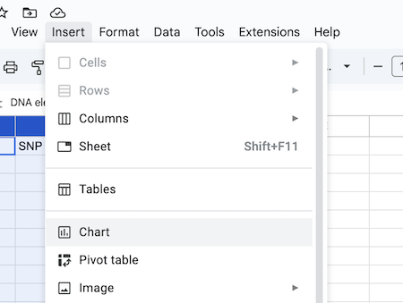
Figure 4. Screenshot Sheets menu, insert Chart.
Given this data setup, Google Sheets defaults to a pie chart (Fig 5), which isn’t the one we wanted (seeFig 6).
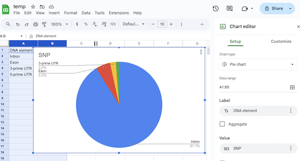
Figure 5. Screenshot of Sheets Chart — default for this kind of data is a pie chart.
One could argue that the pie chart tells the story. However, for a number of reasons (spelled out in Mike’s Biostatistics Book), a bar chart is a better visualization for categorical data like this example. Easy enough to switch chart types. From the Chart editor, select chart type from the drop down list of options (Fig 6).
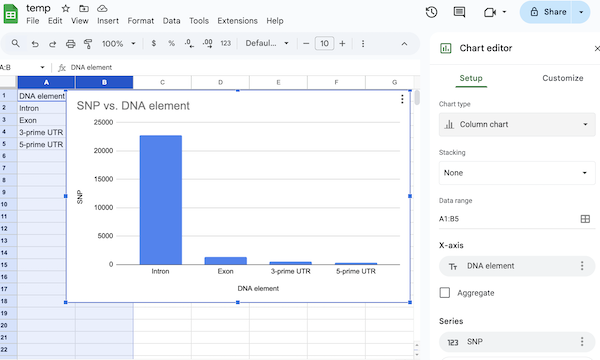
Figure 6. Screenshot of Sheets Chart — bar chart (actually, “column chart” in Google Sheets).
Export the image by first selecting the chart, clicking on the three dot ellipse (upper right of chart image, see Fig 6), then from the popup menu, select Download chart > PNG image (or PDF if you prefer).
/MD