Molecular clock
to do
Fix images- update links
- Organize page
move regression instructions
This page describes ongoing analytical steps for the GWAS and essential genes project.

The purpose of this exercise is for you to construct a molecular clock model for the gene you have been working with (i.e., the one you selected in the PheGenI exercise)
- Collect the data for the molecular clock: divergence times and pairwise genetic distance among the 14 taxa.
- Produce scatter plot of genetic distance by divergence time.
- Estimate the rate of evolutionary change for the gene by estimating the slope of a linear regression (through the origin) from the data set used to construct the molecular clock.
- Relate the rates of change to the gene ontologies obtained in the earlier labs for these genes.
- Share your slope estimates with the class to compile rate estimates for the different genes.
Quick to do
- Navigate to your working folder and set up a spreadsheet file
- I recommend use of desktop Microsoft Excel or LibreOffice Calc; Although Google Sheets and Numbers can do most of the work needed, getting the regression equation is trickier.
- Of course 😉 R, the statistical programming language, is made to do these kinds of analyses — and the learning curve is actually shorter than doing the same kinds of analysis with a spreadsheet app! See Why do we use R Software? in Mike’s Biostatistics Book.
- Run a simple program on your ML newick tree (or NJ tree, if that’s the only one you made), to extract pairwise distances from the branch lengths (How to get the distances from a distance tree). Copy/paste results to your spreadsheet file.
- Obtain pairwise divergence times (Finding divergence times, this page); merge or copy/paste results to your molecular clock spreadsheet file.
- Make a scatterplot (Distances by divergence in MA, “Millions of years Ago”).
- Report the regression equation (regression through the origin, i.e., Y-intercept equal to zero)
- You turn in your spreadsheet with the data, plot, and equation — see protocol instructions below in To do.
Resources, this page
In this handout you will find
- brief background about why you are producing a molecular clock analysis (see for more in depth discussion).
- how to obtain the data for the molecular clock.
- protocol to help make the spreadsheet file.
- link to protocol for calculating the regression equation.
Background
OK. Now you should have a gene tree for the product of your GOI and based on the best multiple sequence alignment you can get. What now?
Although you can construct phylogenetic trees for a set of taxa without times assigned to the evolutionary events to accompany the divergence from a common ancestor to new taxa, adding this information permits us to ask fundamental questions. We want to know rates of evolution, the amount of genetic change in a species or a gene compared among species over a unit of time. Evolutionary change results from evolutionary processes at play in shaping the species: genetic drift? Natural selection? Because existing species today are the descendants of processes acting in the distant past (millions of years ago for speciation) and some of those processes (e.g., genetic drift, selection, mutation) are ongoing processes that affect genetic differences, assigning time to the branching events in a tree is an important, but challenging task.
How do we get divergence times? Divergence times are for the events of speciation or cladogenesis. In the absence of fossil evidence, divergence times can be estimated for species by assuming a molecular clock (Kumar 2005, Yi 2013). When fossils are available, these can be used to calibrate the clock, although at best, fossils provide a minimum time since divergence and are therefore a means of relative and not absolute divergence calibration. The concept that differences in numbers of substitutions for a sequence between two species may be a function of the time since the divergence of those species is not a new idea (Zuckerlandl and Pauling 1965), and it is a controversial idea (Takahata 2007), but it has been applied in many disciplines of biology, not just in evolutionary biology. For example, use of molecular clock has been applied to determining the origins of HIV pandemic (Korber et al 2000).
I could write a lot more here, and I am definitely cutting some corners, but instead of filling in the gaps and expanding on the details I point you to additional resources listed below (see References).
Finding divergence times
In order to calibrate the molecular clock we need to use evidence for the speciation event independent from the genetic sequences themselves. Fossils provide that evidence. Fossils are found in layers in the ground, and the layers themselves are assigned dates by methods independent of biology. This idea predates the idea of molecular clocks and, divergence times are now typically a combination of fossil and molecular evidence.
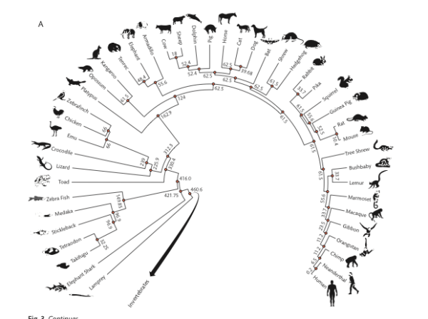
We will use the best estimates available to calibrate our molecular clocks. This information has been collated as part of a very large review on rates of evolution and I provide two graphics for you from this compilation (the two images are from Chapter 4 in an edited book by Hedges and Kumar 2009). In addition, the divergence estimates are now available in a searchable database.
Chaminade Biology students — I have provided you with the complete set of divergence times for all pairwise combinations of your 14 species in a spreadsheet file available at Pairwise divergence times: TimeTree results. Use this file, you do not have to gather all of these times yourself. You must, however, make sure that rows match by species names between your distances and the divergence times.
What follows is a the description of how the divergence times were acquired and what they mean (how to interpret them).
Vertebrates (FIGURE 3A, p. 44)
Invertebrates (FIGURE 3B, p. 45)
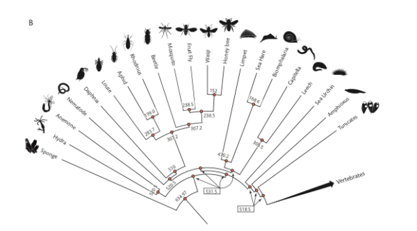
Figure 3. Vertebrate (A) and invertebrate (B) phylogenies with divergence times in MYA.
How to use the image to get divergence times?
Simple 🙂
I’ve provided you with a portion of the file you need to construct your molecular clock. Go to Pairwise divergence times: TimeTree results, which has a link to updated pairwise divergence times, in millions of years ago (MYA or Ma), for our 14 species.
I do expect to see in your notebook evidence that you investigated how to get divergence times between pairs of species, so do read on. You can expect one or more exam questions!
But here’s how you’d do the work yourself. Let’s say I want to get the divergence time between crocodiles and humans — that is, I want the estimate of the last common ancestor between the two species. First, identify the two species at the tips (leaves). Second, trace the branches back to the intersection between the two leaves of the phylogenetic tree. Here’s an animation of the process (tracing the branch lengths between humans and alligators).
New resource for obtaining divergence times!! To find divergence times between two taxa (e.g., humans and mice) I would typically work by looking for a recent review via a Google Scholar search, painstakingly searching for original papers on fossil evidence, etc. However, there is a fantastic resource at http://www.timetree.org, that allows you to collect divergence times. Using their “TimeTree Search” form you can find best estimate for divergence time, collated for all such estimates. For example, I searched for divergence between Homo sapiens and Mus musculus, and the results are shown below (I would use the median divergence time = 88 Ma).
Note: I created this page back in 2018, the median divergence time between mice and men was estimated at 94.5 Ma; estimates of divergence times may change based on new evidence.
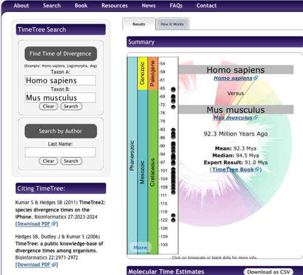
Figure 4. Screenshot of results for divergence times between mice and men, TimeTree.org
Important! If you have already created your divergence time list, you do not have to redo your work! Do record in your notebook the source(s) of your divergence times.
Note: I’ve provided you with an Microsoft Excel file with all 91 divergence times at Pairwise divergence times: TimeTree results
To do:
Protocol to complete your molecular clock file. You should now have two spreadsheet files. One file contains the extracted distances from your best gene tree (How to get the distances from a distance tree). The second, created in this exercise, contains the divergence times. Now, merge the two into a single data file, your molecular clock data set.
See below for an example of a completed spreadsheet
- Open a new Excel spreadsheet file and name four columns
Column A = First Species
Column B = Second Species
Column C = Time since divergence (Ma)
Column D = Total branch length
Column E = log10-transformed Ma - For each pairwise comparison obtain divergence estimates from your UGENE Maximum Likelihood tree diagram (e.g., our best tree); extract branch lengths for pairwise comparisons = Total branch length
- From your research on the Internet*, enter the time in millions of years ago (MYA) fossil the divergence time
- I’ve provided you with an Microsoft Excel file with all 91 divergence times at Pairwise divergence times: TimeTree results
Table 1. The spreadsheet looks like (made up example)
| A | B | C | D | E | |
| 1 | Compare1 | Compare2 | MYA | Distance | MYA, log10 -transformed |
| 2 | Sp1 | Sp2 | 10 | 3 | 1.0 |
| 3 | Sp1 | Sp3 | 30 | 3.5 | 1.477 |
| 4 | Sp1 | Sp4 | 52 | 12 | 1.716 |
| 5 | Sp2 | Sp3 | 12 | 1.1 | 1.0792 |
| 6 | Sp2 | Sp4 | 210 | 10 | 2.322 |
| 7 | Sp3 | Sp4 | 190 | 12 | 2.279 |
Where Sp1 refers to the first taxa in your list (e.g., human), and sp2, sp3, sp4 are the next three taxa from your data set. Preferred distances are found from your Maximum Likelihood tree (see How to get the distances from a distance tree).
Tip: Be advised that creating an X-Y scatterplot within a spreadsheet works best if the “X” is in a column that precedes “Y”. It’s best to rearrange your data set so that MYA or logMYA (X-values) is in column C and Distance (Y-values) is in column D. This will make chart-making easier with a spreadsheet app.
Here’s a video that provides an overview of how to get the data for the Molecular Clock spreadsheet
Make at least one plot. The chart of the raw data set (i.e., not log-transformed) looks like
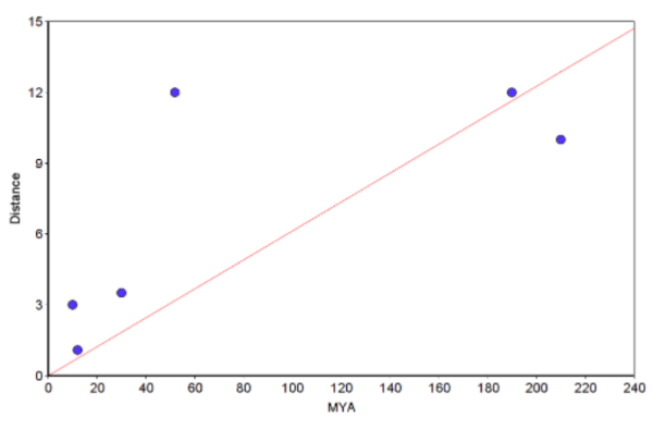
Figure 5. Example “molecular Clock” plot with regression through the origin line (red).
Notes. You can make the graph in Microsoft Excel or other spreadsheet program (I recommend the free LibreOffice Calc. However, For Figure 5, I used a scatterplot graphing tool from a website to make the graph and saved it as a screenshot. The trendline through the origin was calculated by creating a second group with two points (x1=0, y1=0 and x2=210, y2=12.873; multiply 210 by the slope). Many of you choose to use Google Sheets. That’s fine, but note that with the exception of making a plot, Google Sheet option is a harder choice (e.g., you’ll have to use the LINEST() function to get the regression without the Y-intercept). Like my example, you get the trendline by adding a second group. See also How to obtain slope of the regression.
Obtain slope estimates for rate of evolution of your gene product
Click here to get instructions to help calculate regression coefficients (slope, y-intercept) using spreadsheet or R statistical programming language.
Reading and Resource links
http://evolution.berkeley.edu/evosite/evo101/IIE1cMolecularclocks.shtml
http://en.wikipedia.org/wiki/Molecular_clock
Ho, S. (2008) The Molecular Clock and Estimating Species Divergence. Nature Education 1(1).
Benton, M. J., Donoghue, P. C. J., & Asher, R. J. (2009). Calibrating and constraining molecular clocks. The timetree of life, 35, 86.
Kumar. S. (2005) Molecular clocks: four decades of evolution. Nat, Rev, Genet, 6:654-662.
Margoliash, E. (1963) Primary structure and evolution of cytochrome c. Proc. Natl. Acad. Sci. USA 50:672-679
Yi, S. (2013) Neutrality and Molecular Clocks. Nature Education Knowledge 4(2):3
Zuckerkandl, E., & Pauling, L. (1965). Evolutionary divergence and convergence in proteins. In Evolving genes and proteins (pp. 97-166). Academic Press.
/MD