How to obtain slope of the regression
to do
Fix images- update links
- Organize page
- Fix R instructions
Your data consists of two (or more) ratio-scale (continuous) random variables.
For example, from Molecular clock, we have
Table 1. The spreadsheet looks like (made up example)
| A | B | C | D | E | |
| 1 | Compare1 | Compare2 | MYA | Distance | MYA, log10 -transformed |
| 2 | Sp1 | Sp2 | 10 | 3 | 1.0 |
| 3 | Sp1 | Sp3 | 30 | 3.5 | 1.477 |
| 4 | Sp1 | Sp4 | 52 | 12 | 1.716 |
| 5 | Sp2 | Sp3 | 12 | 1.1 | 1.0792 |
| 6 | Sp2 | Sp4 | 210 | 10 | 2.322 |
| 7 | Sp3 | Sp4 | 190 | 12 | 2.279 |
Where Sp1 refers to the first taxa in your list (e.g., human), and sp2, sp3, sp4 are the next three taxa from your data set.
Next, you will need to calculate the linear regression slope, through the origin. If you recall from your algebra class or your (bio)statistics class, the linear regression equation is Y = a + bX, where a is the Y-intercept (the value of Y when X = 0), and b is the slope or rate of change in Y given change in X. Thus, the equation for the regression through the origin is Y = bX.
You’ll need an app to help you complete the analysis.
- I recommend use of desktop Microsoft Excel or LibreOffice Calc; Although Google Sheets and Numbers can do most of the work needed, getting the regression equation is trickier.
- Of course 😉 R, the statistical programming language, is made to do these kinds of analyses — and the learning curve is actually shorter than doing the same kinds of analysis with a spreadsheet app! See Why do we use R Software? in Mike’s Biostatistics Book.
Select your software choice from the list
Note — in my opinion, R is much easier to work with for statistics! LibreOffice Calc would be my second choice, with Google Sheets my last option 😉
Use of Microsoft Excel app
Once you have plotted a scatter plot for the data in Table 1 (see Molecular clock), then you can extract the linear regression equation by way of “trend line” options.
If you have the desktop version of Microsoft Excel (or Calc, LibreOffice ), you can do this simply by applying a linear trend line. For Google Sheets, you cannot use the trendline function, at least not as of 2025.
Assuming you have desktop Excel or Calc, the following instructions work. Note however that we want regression through the origin (a = 0), so the equation is Y = bX . After all, if divergence time was zero years, what genetic distance should there be between two taxa?
- For the untransformed “raw” data set
- For the log-transformed data set (semi-log — transform only the “Years” or X-variable);
- use the log-10 transform. In Excel, in an empty cell (e.g., E2 in my spreadsheet example), type “=log10(D2)” (without the quotes). This would return
the log10 value for value in cell D2 (in this case, would
3. Insert Chart, scatter plot option (Fig 1).
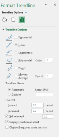
Figure 1. Screenshot, desktop Microsoft Excel, Trendline options menu.
My results: for raw data set, slope (+ standard error) = 0.06130 (0.01501) and for transformed data set, slope (+ SE) = 4.5040 (0.7314)
What about LibreOffice Calc?
LibreOffice also provides a simple trend line approach, and you can force the linear regression through the origin, just like Microsoft Excel. I’ve recommended before you consider the free, open source office package called LibreOffice, available for Linux distros, macOS, and Windows 10/11 computers. This is one example in which LibreOffice makes your work simpler than more familiar options. For example, Google Sheets and Numbers don’t have a simple way to get trend lines through the origin.
What if your are using Google Sheets?
teps for intercept model
- Open your molecular clock data file in Google Sheets
- Take the time to arrange your data columns so that X (MYA or logMYA) and Y (Distance) columns next to each other, the column with X variable left of the column with Y variable.
- Highlight the X and Y columns (click and hold on the header for the X column then move to the Y column)
- From menu bar select Insert –> Chart
- Select data series
- Check Trendline
- Label, select Use equation
- Check Show R2
From the chart, find the slope (yellow highlight, figure 1) and R2 value (green highlight, Fig 2).
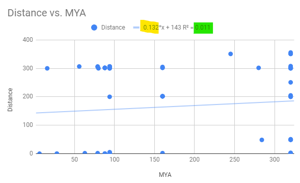
Figure 2. Regression equation, includes Y-intercept, on raw untransformed data.
Next, log10-transform the X variable (MYA)
Create a new column, label logMYA. For this example, let’s go with column G. I assume, again for this example, that the raw MYA are in column C and the Distance values are in column D.
In the first open cell, G2, type the equals sign and the function call =log10(c2), then hit enter. The cell will be updated with the log-base-10 of the value in C2
Complete the transform for the rest of the values. An easy way to do this is to double-click on the “+” that appears when you hover the mouse over the lower-right part of the cell.
Now, copy and paste all values from column D to column H.
Make the new plot and obtain slope and R2 from the new trendline by repeating steps 3 – 8
From the chart, find the slope (yellow highlight, figure 1) and R2 value (pink highlight, Fig 3).
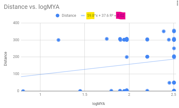
Figure 3. Regression equation, includes Y-intercept, on transformed data.
Steps for no intercept model
You’re correct, can’t get a line through the origin using only the trend line option.ad, use LINEST(). Click on an empty cell (e.g., D2), and type in “=linest(B2:B7,A2:A7,FALSE,FALSE)“, everything except the quotes.
Table 1. Same example data set from Table 1
| A | B | |
| 1 | X | Y |
| 2 | 10 | 3 |
| 3 | 30 | 3.5 |
| 4 | 52 | 12 |
| 5 | 12 | 1.1 |
| 6 | 210 | 10 |
| 7 | 190 | 12 |
The output will be two numbers, the estimate of the slope (D2), and “0” (E2). Zero, because the Y-intercept was set to go through the origin by adding “FALSE” at the third element of the LINEST() function call.
Table 2. LINEST() result, Google Sheets
| D | E | |
| 1 | ||
| 2 | 0.006279580901 | 0 |
D2, that’s the slope estimate
E2, that’s the Y-intercept estimate, which we set to zero
While we’re at it, If you set that last option to TRUE, forces Google to return an array of results (Table 3).
Table 3. Full LINEST() results, Google Sheets
| D | E | |
| 1 | ||
| 2 | 0.006279580901 | 0 |
| 3 | 0.01500575823 | #N/A |
| 4 | 0.7694620448 | 4.350324335 |
| 5 | 16.68840266 | 5 |
| 6 | 315.8333909 | 94.62660908 |
Unfortunately, Google doesn’t label these results. So here goes:
D2, E2: that’s the slope estimate, Y-intercept estimate, which we set to zero
D3, E3: Standard error (SE) slope, intercept
D4, E4: Coefficient of determination, SE Y estimate
D5, E5: F-statistic, degrees of freedom
D6, E6: regression sum of squares, residual sum of squares
Now, we need to revise our plot. Create a new variable titled, for example, trend, then multiply each element of the X variable (MYA in our case), by our new slope calculation. For example, to add the new value to the C column in our worksheet, type in the cell C2
=a2*d$2
which will return the predicted value we want. Carry this out for the remaining rows (Table 5).
Table 5. Calculate data for trend line through the origin
| A | B | C | D | E | |
| 1 | X | Y | trend | ||
| 2 | 10 | 3 | 0.6130068532 | 0.06130068532 | 0 |
| 3 | 30 | 3.5 | 1.83902056 | ||
| 4 | 52 | 12 | 3.187635637 | ||
| 5 | 12 | 1.1 | 0.7356082239 | ||
| 6 | 210 | 10 | 12.87314392 | ||
| 7 | 190 | 12 | 11.64713021 |
then add “trends” to the plot you already created. You can then use the Trendline function again on your regression through the origin data. I would remove the trend line from the regression that included a Y-intercept. The plot is shown in the graph below (Fig 2).
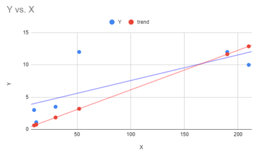
Figure 4. Scattershot of Google sheets scatter plot with trend line fitted through the origin (red) and the default trend line (blue).
Steps for no intercept model
- Within your spreadsheet click on an empty cell
- Type
=LINEST()and enter four instructions each separated by a comma- cell range for Y variable (e.g., Distance). Example: D2:D92
- cell range for X variable (e.g., MYA). Example: C2:C92
- FALSE, which instructs Sheets to only estimate the slope
- TRUE, which instructs Sheets to print out additional statistics, including R2, the coefficient of determination
- The command will look something like:
=LINEST(D2:D92, C2:C92, FALSE, TRUE)
And the output will be
| slope | Intercept | |
| coefficient | 0.7020541285 | 0 |
| coef. SE | 0.07749093676 | #N/A |
| R2, Residual error | 0.4769886112 | 158.5295293 |
| F-statistic, df | 82.08038281 | 90 |
| Model SS, Error SS | 2062812.305 | 2261845.049 |
Note: Of course, Sheets doesn’t provide the handy labels like “slope” and “coefficient,” DrD provides you with that information to help read the output. What do the terms mean? See ANOVA and Linear models.
If you run LINEST() again, but change FALSE to TRUE, then the output includes the Y-intercept estimate.
| slope | Intercept | |
| coefficient | 0.1319088186 | 142.8459704 |
| coef. SE | 0.1331547539 | 28.55585968 |
| R2, Residual error | 0.01090640676 | 140.8427578 |
| F-statistic, df | 0.9813734601 | 89 |
| Model SS, Error SS | 19467.19366 | 1765464.735 |
And finally, Apple Numbers?
I don’t talk much about Apple’s Numbers spreadsheet app. It’s a perfectly good app, but it’s look and feel is distinctive. It also, like Google Sheets, lacks a simple way to get the trend line for a regression through the origin problem. However, like Google sheets, you can obtain one by following the same outline as in Google Sheets, including use of the =linest() function call. The only difference, enter a value of zero (0) instead of “FALSE” to force the regression through the origin.
Run the statistics yourself in R
We have also been working with R. Use your installation of R, or your other options, or scroll to bottom of this page where I have embedded the rdrr.io (Links to) script engine for your use.
Have your data set ready. The easiest thing is to save your data to a comma-delimited text file to your working folder (but see instructions below to enter data directly into R by way of read.table), then in R, open a new script document, copy and paste the code, and submit the following commands.
Regression in R is simple with the lm() function.
myData <- read.table(file.choose(), sep = ",", header = TRUE)
# myData
x = myData$MYA
y = myData$Distance
#With intercept
resulta <- lm(y~x)
summary(resulta)
#without intercept
result <- lm(y~0+x)
summary(result)
Output from R, in red
And what about the plot? In R, the command for the plot is simply “plot.” But we also want to set the axis range (xlim, ylim), add axis labels (xlab, ylab), increase the size of the data points (cex=1.5), color (col="blue"), and select the data point type (pch=19 selects filled in circle). Last, add our trend line (use lm() function; don’t forget: through the origin for molecular clocks) (Fig. 7).
plot(x,y, ylim=c(0,15), xlim=c(0,240), xlab="MYA", ylab="distance", cex=1.5, col="blue", pch=19)
#draw the trend line
abline(lm(y~0+x), col="red")
Which returns the following plot (Fig 3).
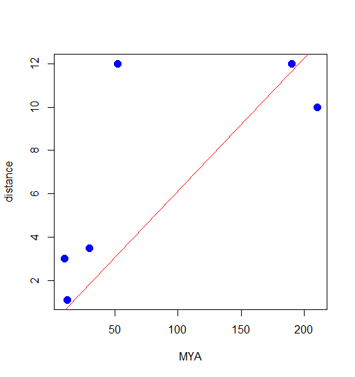
Figure 3. Scatterplot from R with trendline through the origin.
How to run R code
You can install R onto your computer. Go to
Or, you can run it from within your browser by going to rdrr.io
Or, you can run the code by updating code in this embedded window
And for completion, what if you want to grab the data from your spreadsheet and get it into R? If you are running in browser, then you have to paste the data into the window
myData <- read.table(header=TRUE, sep="\t", text="
Color    Var1    Var2
red    0.3    1.2
red    0.33    1.4
red    0.23    0.9
blue    0.6    2.2
blue    0.8    2.1
blue    0.7    2
")
Replace my data with your own. If you copy/paste from your spreadsheet, columns are separated by tabs (hence the “\t” in the R code).
If you have installed R onto your computer, then the straightforward way is to copy your X and Y data (MYA, Distance) to a new text file, then use
myData <- read.table(file, header=TRUE, sep="\t")
and replace “file” with the name of your data file (including path if the file is not in your working directory).
Another option is to install the package clipr, and use the following commands
#This script describes a way to copy data from your spreadsheet to R via your computer's clipboard. It requires that you install the clipr package. This works for two columns, for example, to make a scatterplot or to calculate a correlation, or run a simple regression. I'll use it to demonstrate how to make a plot of your "molecular clock" plus trend line through the origin. Assume that the first column contains your X (millions of years), and second column contains your Y (genetic distances)
#Works on local R installation, but not with rdrr.io
library(clipr)
#go to spreadsheet, copy your two columns of data, including the header row, then execute the following command.
myData <- read_clip_tbl()
#check to see that all 91 rows plus the first header row of data loaded
myData
#This next command tells R to store the data so you can just refer to the variable names; R will know that the current dataset is "myData"
attach(myData)

#Now, as before, make the plot and force the regression through the origin, add a red line
plot(MYA,Distance)
abline(lm(Distance~0+MYA),col="red")
Use of R
This example works with the R statistical programming language.
Assuming you have installed R to your computer, or use R at one of the many Cloud sites, then regression is simple. The instructions presented here include use of the R Commander package to facilitate use of R.
Load your data file.
Assume y variable is in column with header Distance; x variable in column with header MYA in an open spreadsheet file.
I copy variables, including header row, from the spreadsheet to the clipboard, then run the following script in R
myData <- read.table("clipboard", header=TRUE, stringsAsFactors=TRUE, sep="", na.strings="NA", dec=".",
  strip.white=TRUE)
For a regression model with the intercept run the following two lines of code
RegModel.1 <- lm(Distance~MYA, data=myData)
summary(RegModel.1)
And R output is …
I bold-typed statistics you’ll want to record.
Call:
lm(formula = Distance ~ MYA, data = myData)

Residuals:
    Min      1Q  Median      3Q     Max
-183.80 -153.30   37.77  145.62  175.59

Coefficients:
            Estimate Std. Error t value   Pr(>|t|)
(Intercept) 142.8460    28.5559   5.002 0.00000283 ***
MYA           0.1319     0.1332   0.991      0.325
---
Signif. codes:  0 '***' 0.001 '**' 0.01 '*' 0.05 '.' 0.1 ' ' 1

Residual standard error: 140.8 on 89 degrees of freedom
Multiple R-squared:  0.01091,    Adjusted R-squared:  -0.000207
F-statistic: 0.9814 on 1 and 89 DF,  p-value: 0.3245
I like to run another command to get the regression (ANOVA) table
Anova(RegModel.1, type="II")
R output now
Anova Table (Type II tests)

Response: Distance
           Sum Sq Df F value Pr(>F)
MYA         19467  1  0.9814 0.3245
Residuals 1765465 89
For regression through the origin (no intercept model), run
LinearModel.3 <- lm(Distance ~ 0+MYA, data = myData)
with R output
Call:
lm(formula = Distance ~ 0 + MYA, data = clock)

Residuals:
    Min      1Q  Median      3Q     Max
-223.40  -65.77   75.33  189.58  288.76

Coefficients:
    Estimate Std. Error t value Pr(>|t|)
MYA  0.70205    0.07749    9.06 2.58e-14 ***
---
Signif. codes:  0 '***' 0.001 '**' 0.01 '*' 0.05 '.' 0.1 ' ' 1

Residual standard error: 158.5 on 90 degrees of freedom
Multiple R-squared:  0.477,	Adjusted R-squared:  0.4712
F-statistic: 82.08 on 1 and 90 DF,  p-value: 2.584e-14
and again, run Anova() command to get the regression table
Anova Table (Type II tests)

Response: Distance
           Sum Sq Df F value    Pr(>F)
MYA       2062812  1   82.08 2.584e-14 ***
Residuals 2261845 90
---
Signif. codes:  0 '***' 0.001 '**' 0.01 '*' 0.05 '.' 0.1 ' ' 1
/MD