Spreadsheet pivot tables
Pivot tables are one of the best things about spreadsheet apps. Pivot tables are used to group, summarize or reorganize data in a worksheet. At the bottom of this page, suggestions for simple data visualization options based on pivot table results are available, with links to help pages on this website.
For example, one of the tasks I ask you to do for our large bioinformatics project is to summarize the number of SNP associated with your phenotype of interest (Protocol: GWAS and the PheGenI Database). This involves getting the total count, but more importantly, I expect you to be able to display the counts according to the location (context) in which the SNP is located in the genome. When the results are numbered in the few, this is an easy task. For example, toxoplasmosis, only a single SNP (rs1009840) is found, and it is located in an intron of the gene SGK1. At more than 1500 associations, this is not a simple task for phenotype of interest schizophrenia. The purpose of this handout is to take you through steps to run a pivot table using Google Sheets * to solve the problem. I assume you have already downloaded the results from your PheGenI trial (Protocol: GWAS and the PheGenI Database).
* Of course, other spreadsheet apps also can do pivot tables.
- Click here for Google Sheets instructions.
- Click here for Microsoft Excel instructions.
- Click here for LibreOffice Calc instructions.
- Click here for Apple Numbers instructions.
Get the data into Google Sheets
Logon to your Google account to access Sheets.
Step 1. Create a new worksheet in Google Sheets.
Step 2. Import text file into Google sheets (Fig 1).
File → Import
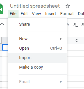
Figure 1. Screenshot Google Sheets menu, import text file.
Click on the Upload link and then either drag and drop the file, or use the “Select a file from your device” button (Fig 2). This is my preferred choice.
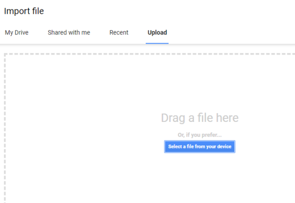
Figure 2. Screenshot Google Sheets menu, drag or select a file from device to import a file.
For this example, we are working with results from PheGenI. The default file name is PheGenI_Associations.tab (Fig 3).
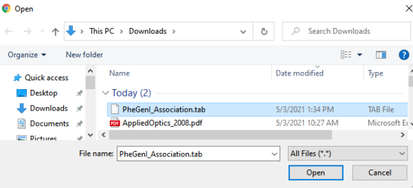
Figure 3. Screenshot Google Sheets menu, select a file from device to import a file.
The data should now be in Sheets, with each tabbed column properly assigned to a column in Sheets.
Make the Pivot
We are going to count each instance of “Context.” To begin making a pivot table, click on the D column header to select the entire column. Column D contains the data we want (Fig 4). Note the data does not need to be sorted.
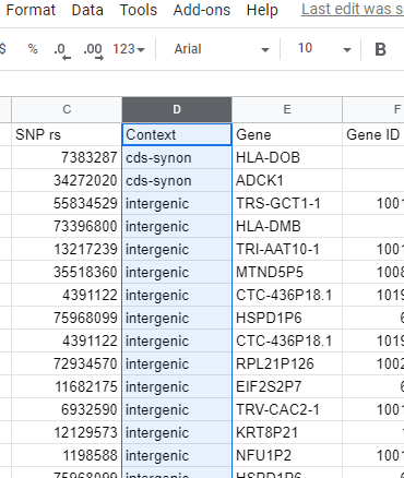
Figure 4. Screenshot Google Sheets with data. Column with values to be counted selected, visible in light blue highlight.
Next, from the menu bar, click on Data → Pivot table (Fig 5).
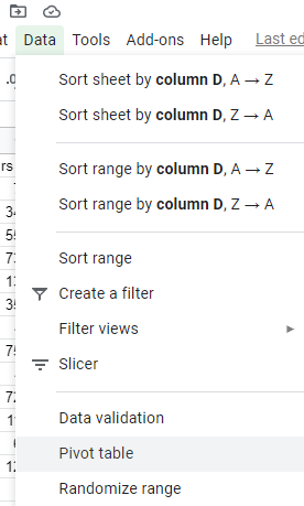
Figure 5. Screenshot Google Sheets menu, select Data, then Pivot table.
Next, confirm that the Data range is correct. In the image (Fig 6), you can see the reference to PheGenI_Association!D:D, which is correct — we selected all of column D.
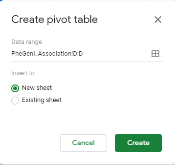
Figure 6. Screenshot Google Sheets Pivot table context menu, confirm range and creation of a new sheet.
The result is the beginning of your pivot table (Fig 7). We next proceed to populate the table (see Fig 8).
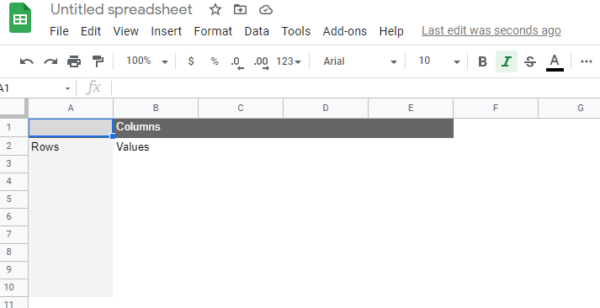
Figure 7. Screenshot of the new pivot table, waiting for input from the user how to proceed.
Locate the Columns button in the popup menu “Pivot table editor,” at the right of your screen (not shown in Fig 7). Click Add, and locate “Context” (Fig 8, which, for our example, is the name of the column with our data).
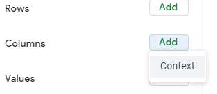
Figure 8. Screenshot of a portion of the Pivot table editor menu, select Add and, for this example, Context.
Note how the pivot table now has the correct headers (Fig 9).
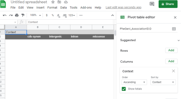
Figure 9. Screenshot of the new pivot table with correct column headers visible in Pivot table editor.
Finally, we need to get the counts (Fig 10). Click Add button associated with Values field. Select “Context” from the list.
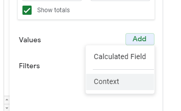
Figure 10. Screenshot of Pivot table editor, Values option set to Calculated Field.
We’re almost there!
After selecting “Context”, select “COUNTA” from the drop down list for “Summarize by” (Fig 11). You can leave “Show as” Default, or explore the different.
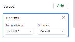
Figure 11. Screenshot of Pivot table editor, Values option for Context column set to Summarize by COUNTA.
Once the values option is set, the Pivot table is updated, and you may close the Pivot table editor. Our completed pivot table is shown in Fig 12.
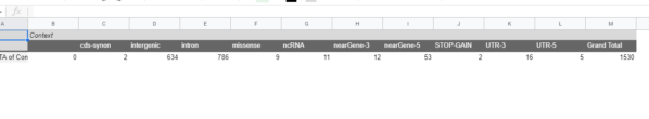
Figure 12. Screenshot of completed pivot table for example.
What’s next?
Sometimes a table is just what you want to help communicate results. Perhaps more often, some graphic to visualize the data will be called for. Once a pivot table is constructed, a bar chart or a histogram may be good options.
Histogram from a spreadsheet pivot table
/MD